
Redesign of vodka Kraya RodnieThe company Russkiy Vodochnyy Holding has set us the task to re-design the label of a well-known vodka brand Kraya Rodnie. Keeping the design premium recognition, we made the product more sincere and understandable to a wide audience, focusing the consumer attention on beautiful and symbolic places of our native land. Fulfilling this task we made a two-stage label with soft undulating outlines. We redesigned the previous logo, removing associations with a road sign and made the serial dilution of the product possible. 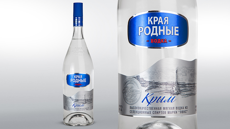

redesign, label design, pre-press
|