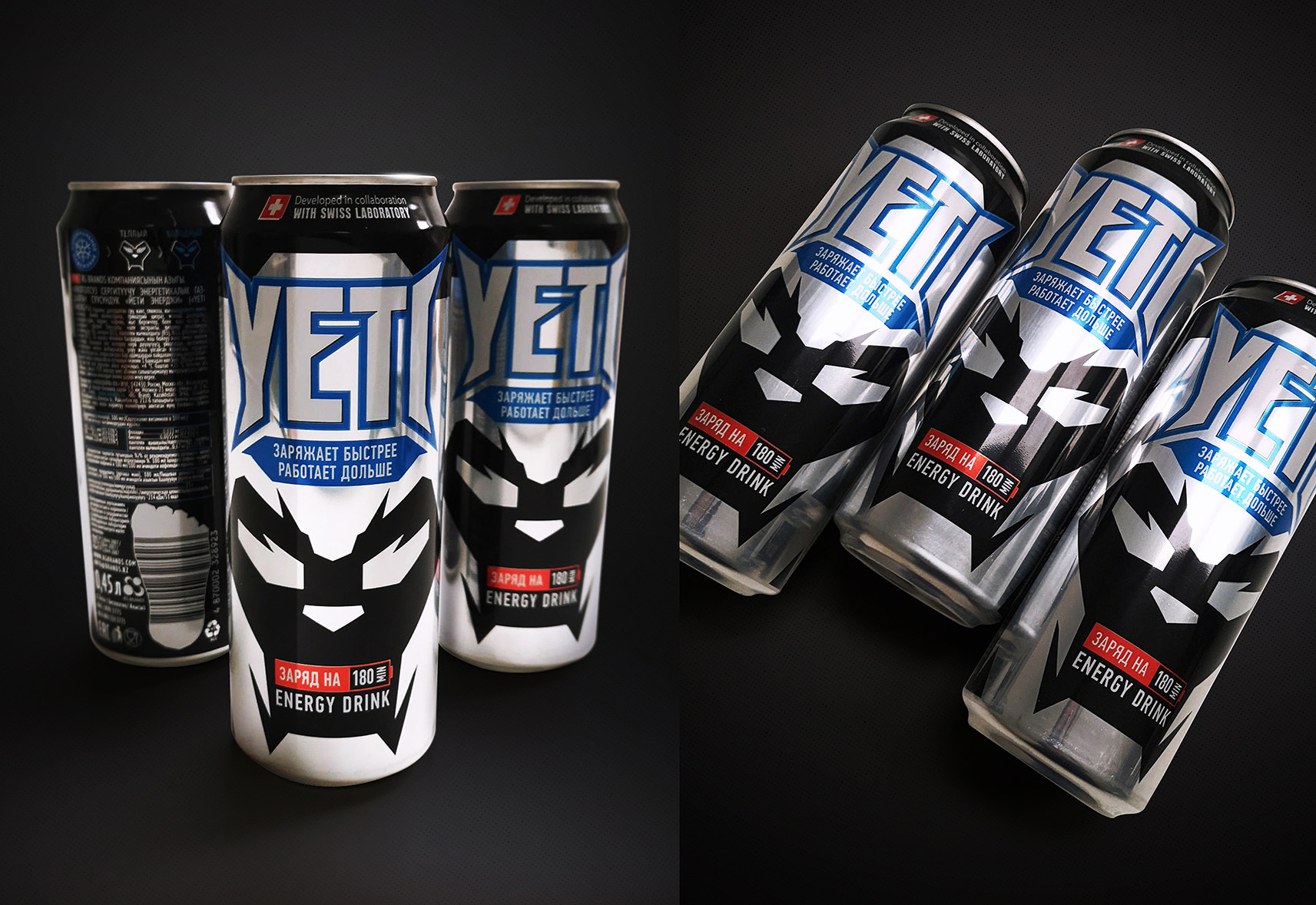
New identity for YETI energy drinkRG Brands is a leading beverage company in Kazakhstan. The company’s brands are widely popular in Russia, Kazakhstan and Kyrgyzstan. RG Brands is the official partner of PepsiСo International and Pepsi Lipton International in both Kazakhstan and Kyrgyzstan. We were entrusted with a task of drastically revamping the visual image of the energy drink brand. Nowadays, this is one of the fastest growing categories across the globe, and, particularly, in Kazakhstan. Over the past 5 years, the current segment has grown more than twofold. For that reason, the YETI renewal project has turned into an important stepping stone in the development of the company’s brand portfolio. The primary objective of the rejuvenated design is to strengthen the image component of the brand, make it more daring, stylish, modern, cool, in order to first and foremost attract the attention of a younger audience, but at the same time, inspire confidence among the older consumers. An important stage in the re-design was the transition from a plastic bottle, which was negatively perceived by the current audience, to a more popular and already traditional format — an aluminum can. Taking full advantage of the contrast between a light aluminum background and color black, a portrayal of a stylized, dynamic character became the foundation of a new design. What is more, the compositional emphasis of the packaging is a new, expressive and dynamic logo, complemented with a functional descriptor “Charges faster, lasts longer”, which communicates the product’s major practical advantage, its powerful energetic effect. Another design feature worth mentioning is its innovative thermo-paints that make it possible to change the color of the character’s eyes, acquiring a blue tint when chilled. 


package redesign, can design development, illustration, prepress
|