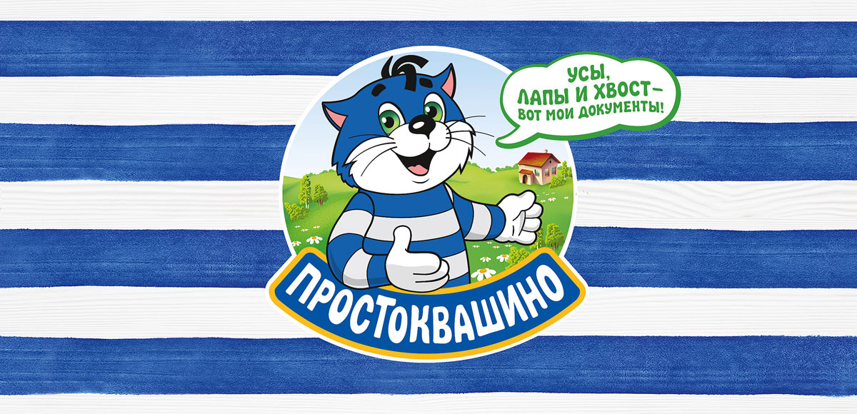
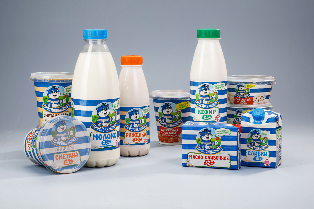
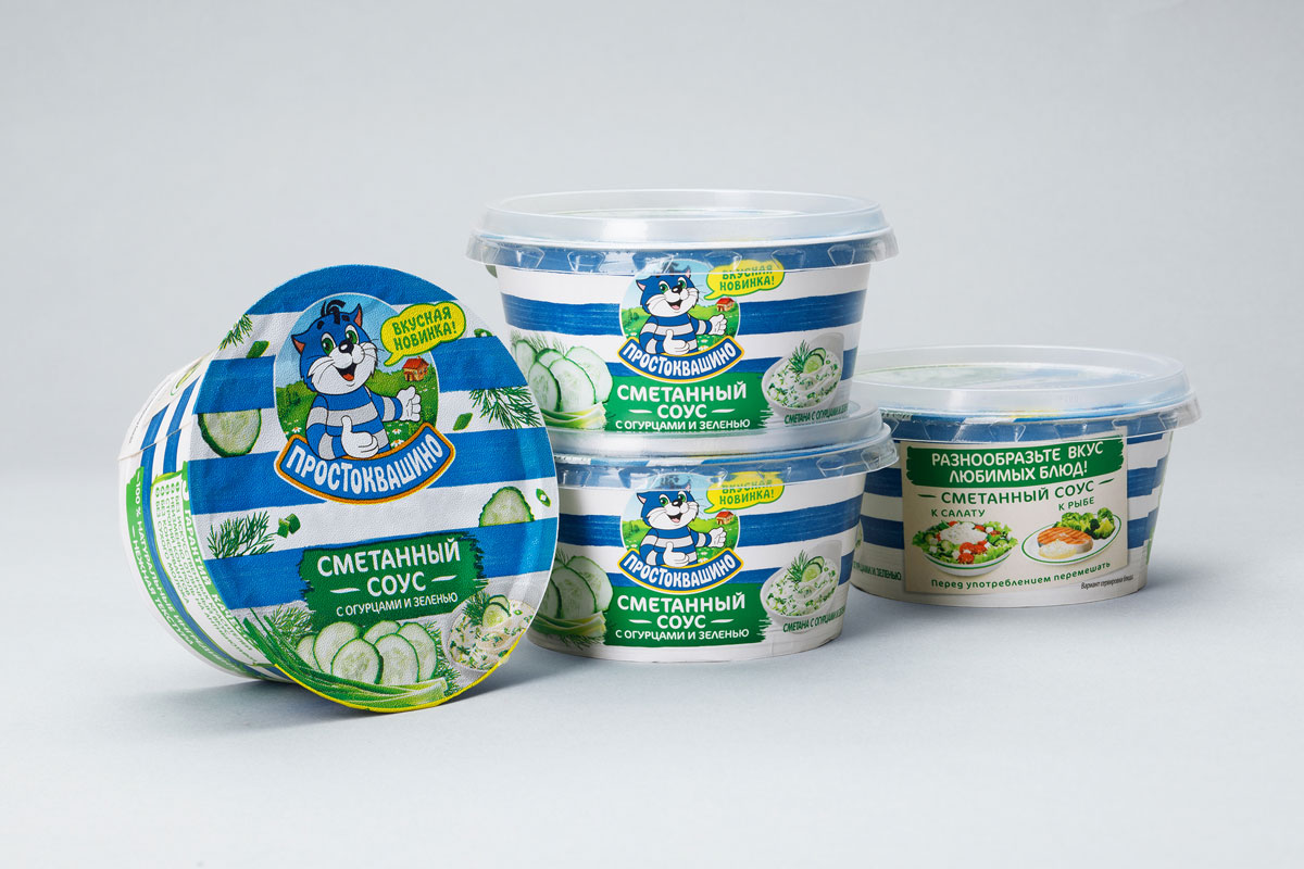
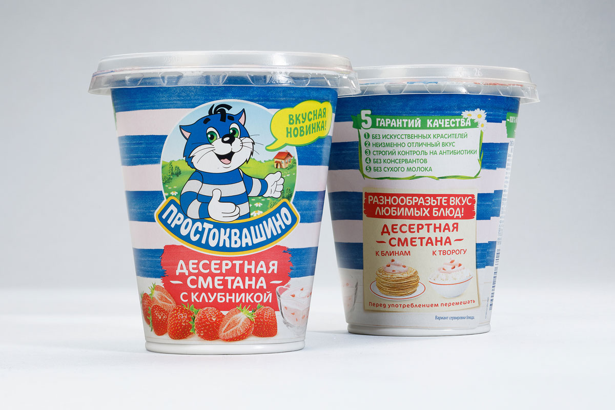
Prostokvashino redesignProstokvashino brand occupies the largest market share on the Russian dairy market in terms of sales volume tonnage-wise (according to Nielsen data for February-March 2015). It is constantly evolving, expanding its product line and winning over the hearts of consumers. Prostokvashino history dates back to 2002, when Unimilk reached an agreement with the writer Eduard Uspensky. The company gained the rights to use characters of the book “Uncle Fedya, His Dog, and His Cat” on the product package design and in advertising. And for good reason, seeing that in 17 years Prostokvashino has become the largest Russian brand in the dairy product category, and these days the brand’s products are sold not only in Russia, but also in Ukraine, Belarus and Kazakhstan. The main priority that the Viewpoint agency team had to work on was to enhance the ultimate benefits of the Prostokvashino brand — first and foremost, we’re talking about flavor and natural ingredients. It was also crucial to integrate the new key brand communication – “natural yumminess”. Working on the design, we preserved the blue stripes as important elements of the brand identity, and what is more, we decided to bolster this technique, so the stripes grew in number and received a vibrant watercolor texture, thereby strengthening the image of warm-heartedness and genuineness. Courtesy of this technique, the blue-striped block of products became even more noticeable on the shelf. Evolutionary changes affected the logo as well: Matroskin’s posture has become livelier; from now on he interacts with the consumers, encouraging people to visit his beloved Prostokvashino with an inviting gesture. And now there is also a cute bubble right next to the character, which will broadcast both important messages of the brand (natural yumminess/delicious new product) and funny and well-liked quotes from Matroskin from the cartoon. The writing style of the product category was preserved, but for clarity of perception, names are now placed in separate plates framed with watercolor leaves. Going forward with the project, we developed the main SKUs and determined the principles of design scaling for other packaging types, which Danone designers continue to work on. Alternatively, our team had to focus on the development of appearance of the all-new products that were set for release: dessert products, sour cream sauces and children’s products. In the course of this part of the job, it was necessary to find balanced visual solutions that, on the one hand, should be in tune with the new visual style of the brand, and on the other hand, should favorably differentiate the new products and their flavor advantages for the consumer. In light of this, unlike traditional sour cream, these SKU designs contained mouth-watering product groups and artwork on the back, revealing the most common ways of its consumption. At this point, the Prostokvashino brand has not only strengthened its leading position, but also continues to grow rapidly and successfully. It already has 35 different SKUs, and it is truly a favorite household brand! 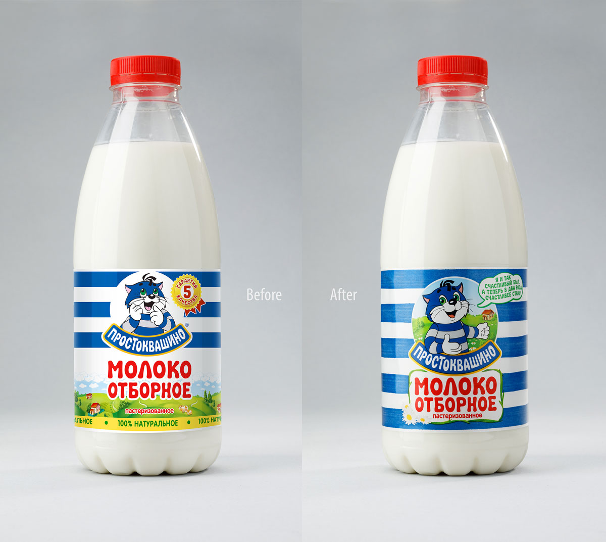


Brand redesign, package design, illustration, line extension, development of new SKUs
|