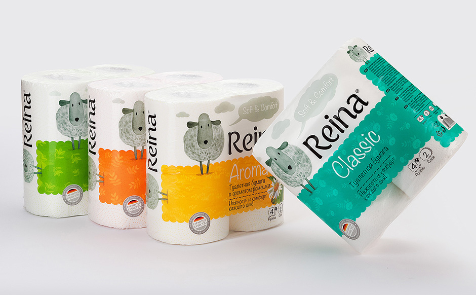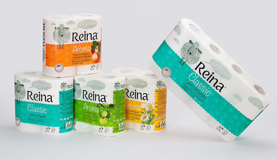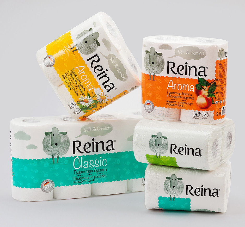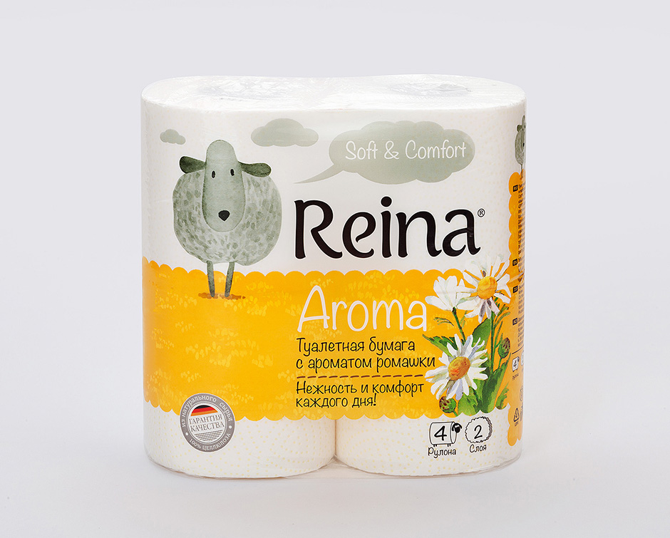
Reina — new tissue brand developmentBranding agency Viewpoint commissioned by Kazan investment company Pulp Invest developed a new Russian trade mark of hygiene paper products with the ‘German roots’. The agency was tasked to develop a new brand that would tell about the product high quality (which is produced using Austrian cellulose and German equipment) and its affordable price. At the same time the brand must be clear, simple and emotional, appealing to a large audience. As a result, there was created a brand character — a lamb with a German name Reina (‘Rein’ in German is ‘pure’). An emotional image of lamb Reina is all about tenderness, sincerity, care and sensitivity. These qualities were essential for the manufacturer as representative features of their brand. The values that it conveys to the consumer are taking care of family and children, housekeeping, the desire to create coziness and comfort. All members of the family cherish kindly feelings for the lamb: small children – because it looks like their album drawings, and very demanding adults simply can not pass by those friendly eyes! In addition, due to the graphical methods there has been achieved the perception of the brand as a high-quality German product, taking into account the features of German production technology. The trade mark guarantees the product high quality and the exclusive production using natural raw materials, as well as the affordable price for the customer! 


New brand development, brand positioning, naming, packaging design, line extension, prepress
|