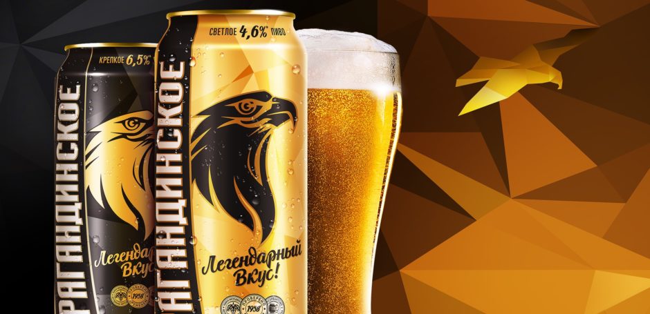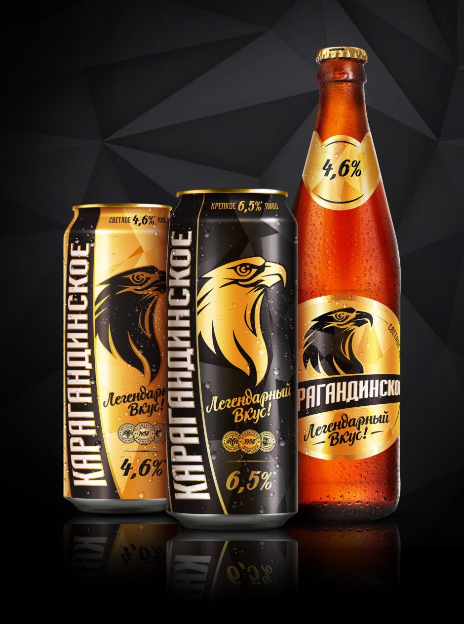
Karagandinskoe RedesignKaragandinskoe beer is one of the most renowned beer brands in Kazakhstan, its history dates back to 1958, when based on the classical principles and consumer preferences Karaganda plant technologists created beer, which in the years that followed became a household name throughout the entire country. In 2018, the brand celebrated its 60th anniversary. It has won several prestigious awards and is one of the most valuable and sought-after brands in the Efes Kazakhstan portfolio. Yet despite the brand’s huge popularity and consumer loyalty, there had been a gradual decrease in sales, at which point the company made a strategic decision to change the package design. One of the priorities was renovation and rejuvenation of the brand image, integration of classics, experience and modernity. Having retained crucial recognizable design elements of the brand, such as a brand block in the form of a ribbon and an image of an eagle, it was necessary to offer fresh graphic solutions in order to attract a younger consumer audience. Addressing this problem, we have proposed a contrasting black and gold color scale to further highlight the brand’s ultimate luxury and visibility on the shelf. The eagle’s proud, tough profile, which has turned into a new brand icon, combined with dynamic polygons evoke feelings of masculinity, strength and dignity, individuality and flamboyance of character – the very qualities that are characteristic of the legendary Karagandinskoe! 


Redesign, package design, can design, label design, prepress
|