
Package development for Siem Sam extra-spicy lineThe trends of the last 3-4 years show a noticeable increase in the popularity of fast food. Consumer attitudes towards it are changing, and there has been a persistent rise in product diversity in this segment. There is also a growing demand for new gastronomic experiences, and eclectic “global cuisines” and food festivals are gaining momentum as well. The Kazakh brand of instant noodles Siem Sam is widely known and loved by consumers for its quality, large portions and unusual, intriguing flavors. This time, Siem Sam decided to treat its consumers to a new line of extra-spicy Asian soups: Korean ramen and Chinese Sichuan noodles. We had to break these products away from the original line: and in order to do that, it was necessary for us to create a new brand character — a dragon, work out differentiation zones and additional communications, as well as create a completely different stylistic vision of the product itself, present it as the most delicious, distinctive and relevant product that was in complete cohesion with the entire line. When creating the dragon illustration, we used Asian visual codes and carefully crafted the character’s personality. During our search, more than ten different options were drawn, among which the most appropriate image was chosen. Look for the new monstrously delicious and spicy line of Siem Sam noodles on the shelves of the grocery stores of the largest retail chains in Kazakhstan. 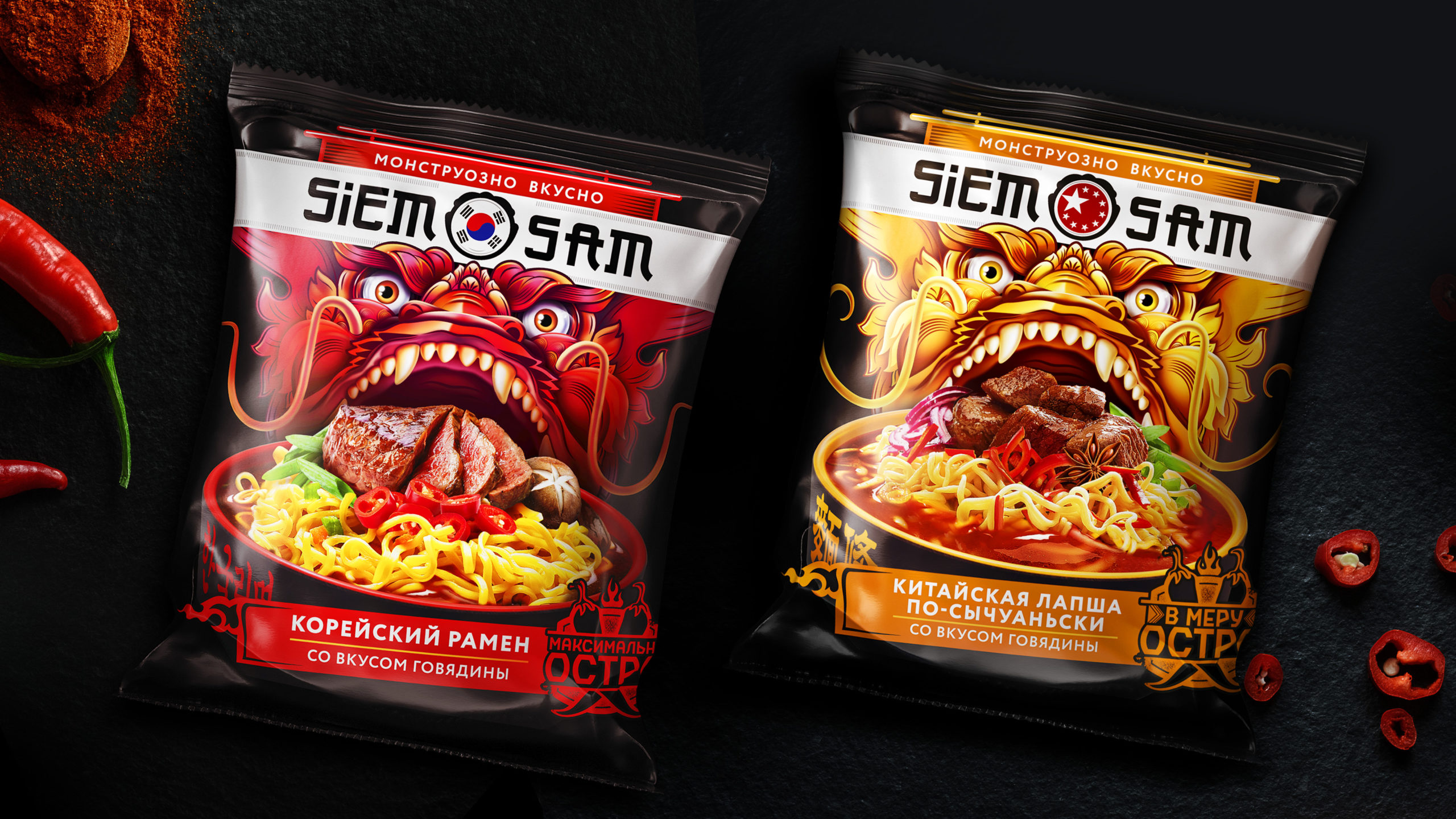

packaging design, character illustration, food style development, product lining
|